The consumer home appliance is increasingly attractive. A little cumbersome object, studied in the minimal details, ready to be displayed in the most chic corner of the kitchen. Materials and colors give the appliance the needed appeal to charm international markets, where it is once again the Italian design to overcome the fierce Chinese competition
by Elviro Di Meo
It is easy to say ‘design’ when the object to design is a table or a chair. The real challenge lies in the creation of products in which it is the performance efficiency, combined with technological innovations and functionality, to interact and, in the most of the times, to condition the shape. The beautiful design, the soft line, the bright and brilliant colors have to reckon with the components, with the power source, the cleaning and maintenance phases of all the machines entered in our homes, in our daily habits, simplifying our life. Household appliances, small or major, are the real test field for every industrial designer, where to experiment intuition and skills acquired over time. Waiting for the Milan Design Week which, as every year, will dictate tastes and trends, some production companies in the SDA sector tell us about market trends and marketing strategies, anticipating their flagship products and the design that characterizes them.
The values that make the difference
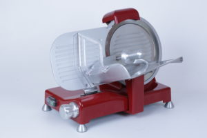
It is called Luxury and is the new slicers collection of RGV, presented at the latest edition of Host Milan 2017. «The design of this new model – explains Marco Di Leo, managing director of the company – was born from the market demand, especially of the end consumers, to have a functional and high-performance appliance, but also easy to clean. For this reason, we have developed the easy clean system which allows the machine plate to be opened by positioning the knob on the “0” indicator so that a larger cleaning space can be obtained under and behind the blade.»

An innovative and safe, risk free system, extensively tested in the laboratory. «The new cover – Di Leo specifies – protects the sharpener both in the upper part and in the lower one, avoiding water and dust infiltrations, thus ensuring greater hygiene.» Considering the final results of the machine, the role played by design in the entire production cycle was decisive and successfully carried on by the internal technical department of RGV. Quality rewarded the time and the profuse investments, increasing the company’s revenue and the widespread distribution in the domestic area and in the professional one. «The Luxury line – added the CEO – presents a modern and appealing design with rounded shapes. We are no more at the presence of the old appliance – functional but, actually, sharp and bulky. The trend has changed. Design is entering more and more into kitchens of consumers and professionals who want a solid high performant product, but also beautiful to see.»
But there is something else. «The end user wants to choose even the color of the home appliance, precisely because he wants to have a piece of furniture to keep in the kitchen. For this reason, Luxury is produced with the base in lacquered gray, in the standard model, but also in the red, black, ivory and also white versions.» It is the market that decides and influences the design of the household appliance, orienting the company strategies. «The most pressing solicitations – Di Leo concludes – come from the Italian one, where RGV has a tradition of almost forty years and the distribution is much more focused and peculiar. Even the foreign market is moving with great speed, but the cooking art and tradition are felt more in Italy than in other European countries where we also export. In any case, the structural changes that RGV brings to its collections take into account the expectations of both markets.»

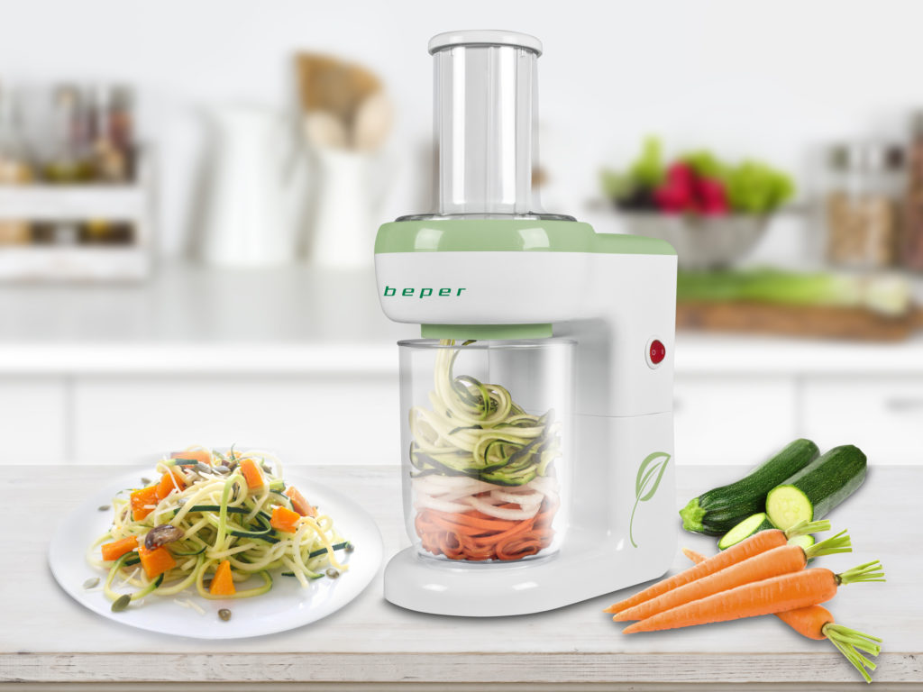
At Beper home the latest news is the new spiral vegetable slicer. The managing director, Gianluca Bosetto presents it to us. «This machine has been realized thinking, at the same time, of two fundamental factors: the aesthetic value and the product use. Its design stands out for clean lines and light colors, white and green, which represent a call to simplicity and to a light and genuine cuisine, but not for this tasteless. We really believe – Bosetto explains – that to considered a product well-done, it must be not only functional but also elegant, intuitive and with an easy maintenance. In addition to the aesthetics and the ease of use, our vegetable slicer is completely dismountable.» This makes it easy to clean and to store in a drawer or cupboard. The company’s successes must be shared with the internal design department, specially created to keep in touch those who develop the products with the values that Beper promotes. «The Italianess of our brand – the managing director specifies – has always been appreciated on the international scene, being recognized as a synonym of reliability and taste, while maintaining a familiar warmth dimension.» «The Italian design – Bosetto added then – is still able to drive trends and consents. In my opinion, however, this influence is stronger on foreign markets than on the local one.» The creations signed by Beper have never escaped the radar of the various design contests. Many of its products have been selected for very prestigious exhibitions, including that organized at the Triennale in Milan on the occasion of Expo 2015. Among various awards, the vegetable slicer participated to the 2017 Brands Award: the initiative by Gdoweek and Mark Up that awards, every year, the best performances of large consumer goods, through objective criteria that involve the final consumers. The company, recently, has promoted an innovative and brave initiative, giving life to the first mono-brand chain of household appliances and homeware, the Beper Home. «This project – the managing director commented – is rapidly growing in Italy and, considering the cultural similarities with Spain, it is ready to be launched in the Iberian peninsula, starting from Barcelona. In addition to Spain, Beper Home wants to be present in all major European countries, including France, Germany and the United Kingdom.»
Another important brand in the household appliance sector is TRABO: Milanese company that has its roots in the design culture. Its rich catalog gave a contribution to raise awareness of the Made-in- Italy in the world, standing out for its originality and creative spirit. Among its symbolic objects there is TOAST, the iconic rectangular toaster, with tautological writing in relief, designed by Gae Aulenti in 1997. And it is just on the occasion of the twenty candles – anniversary celebrated in 2017 with the presence of TOAST in the bookshop and store of the MoMa in New York – that TRABO has relaunched one of its most beautiful product, presented with a new and elegant box. A gift box in birch wood, whose graphics have been designed in synergy with the Atelier Castiglionijr – lab, Federica Castiglioni graphic design.

«The collaboration with Aulenti was born in 1995. The goal was to produce a unique object, in terms of shape and design, that would be able to enter Italian homes, in their kitchen or in the living, as a very beautiful piece of furniture. Gae Aulenti has always been very careful to develop important projects with the various names of architecture and design. For this reason she agreed to collaborate with the Castiglioni family, also tied by a deep friendship.» It is Federica Castiglioni, the current Art Director & Communication of the company, who remembers it. «The binomial of function and aesthetics is still the basis of the TRABO philosophy and it was the same also for the toaster. The meeting with Aulenti turned out to be a success. The alchemy was immediate.»
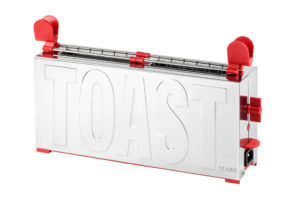
The definitive project came after several ideas. Even the choice of brand naming was subjected to different style and marketing strategy evaluations. In the first sketch, in fact, on the front of the toaster, the word “TOSTO” appeared, which was then changed in “TOAST”, also by the will of Giannino Castiglioni. «Certainly it was the best decision that could be made, because it identified the exact function of the product ». Not only. «At first, in the prototype displayed at Macef in Milan, the name appeared only on one side. Only after realizing the true sales potential – the architect Castiglioni points out – we understood that it would be more convincing if the written was reported on both sides. And this for making the object more recognizable in the various showrooms and stores. The first packaging was made with a cardboard box: a handbag model with red handle, on which a toaster with a slice of sandwich bread was reproduced through a printed drawing ». Details played an important role in TOAST destiny. Well defined details, studied to enhance the recognizability of the product, made of stainless steel, with a two slices holders, complete with red ABS grippers for the bilateral hold. TOAST had two crumbs collectors at the base for the machine cleaning and two feet covered with ABS, always red. «Subsequently – the Art Director of TRABO explains – a black version was prototyped and then realized, to meet the needs of the English market. In London our toaster obtained a great consent and was even displayed for a long period, at the Museum of Contemporary Art.» TOAST, in its twenty years of life, has received many awards. It took part in many Milanese and other design weeks, creating important synergies with companies of the kitchen furniture, fashion and with art and design spaces. «I also like to mention its presence, together with our other products, at the exhibition curated by Antonio Lupi, set up in 2016 at the Triennale in Milan.» TRABO is always ready to open its doors to all the inputs coming from abroad. «We have collaborated with young designers for the development of kitchen scales and wall clocks and for other types of products.
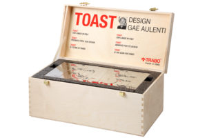
Together with the Atelier Castiglionijr – lab, inside the company, we meet for the concept and development of new ideas in tune with other designers.» Examples are not lacking and are all worthy of mention. «The Kenny hair dryer and the Alice digital electronic scale, designed by Spalvieri Del Ciotto, were recognized in 2009 by Wallpaper magazine for their design value.» Value that remains high if design will continue to speak Italian. «Made-in-Italy is fundamental, and is appreciated all over the world, both for the value of the product and for the dress that is sewn on it» – the Architect adds. «Our company has always believed in this philosophy, which is the only one able to make a difference and a distinction within a hugely mass-market.»

If the quality of the objects is essential, so is the packaging, for which Federica Castiglioni carefully takes care of graphic design & copywrite , together with her collaborators. An indispensable business card to be recognized and competitive on international markets.
Aromatic design: all the taste of coffee
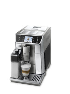
PrimaDonna Elite is the machine signed by De’Longhi – historical brand of the Italian industrial tradition – loved by coffee lovers. «Like all the super-automatic machines of our range, PrimaDonna has the main characteristic of grinding coffee beans at the touch of a button. For this reason – explains Marco Vaona, senior designer De’Longhi – the grinding of grains takes place only when the users wants to drink coffee, not to lose the unmistakable aroma. This machine also allows to choose the parameters of temperature, aroma intensity and length according to the user’s personal taste.

It can be managed through the simple interface of a smartphone, thanks to the De’Longhi Coffee App, with which it is possible to access contents and information about De’Longhi coffee world.» But what is the design of this appliance and how much did the shape affect the final product? «The final result is the synthesis between the technology and the continuous formal and aesthetic details research. The body of the machine is characterized by the frontal surfaces which enhance the ergonomics and ease of use» – Vaona affirms. «The use of the various types of steels gives refined reflexes and defines the different operating zones of the machine. The dispenser is enhanced by a metallic shield where our brand is positioned which has become, so, a kind of quality seal of the dispensed beverage.» De’Longhi has a long history made of international recognitions and awards: from the German Red Dot Design to the Good Design Award Japan. PrimaDonna Elite, in particular, won the Australian Good Design Award and the Plus X Award in Germany. «It is the demonstration – Marco Vaona concludes – that our design is appreciated transversally on a global level.»
Towards a new aesthetics
The attention for the shape and the care for any detail are more accentuated just in those home appliances in which the aesthetic aspect could assume, at least in theory, a less important role than the function. At Reber house, the quality of the project – the same that characterizes all its wide range of products – benefits of important innovative advantages also on a formal level.
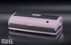
Latest, in order of time, the Pinkki Power line, which includes, in addition to a practical grater for cheese and dry bread, a machine to store food under vacuum, proposed in two different variants. «It is an appliance – explains Maurizio Re, managing partner and sales manager of Reber – which has a renewed aesthetics, obtained by exploiting the color and finish of the surfaces. This type of products continues to have an optimum development in the market. It is still one of the few with strong growth potential, and is not limited to a replacement market.» Pinkki Power, actually, is not a new product: it is a restyling principally based on the use of pastel colors like pink and anthracite, and on the satin effect. Its structure combines rounded lines and sharp cuts, while being conditioned by the limits imposed by the functionality of the object, made by the vacuum chamber and the sealing bar.

«During the latest years – Re explains- there has been a real boom of vintage or artistic design extended to mature products.» Hence the importance of focusing on old style objects, beautiful and performing, developed by external industrial designers with whom the company has consolidated an excellent relationship of collaboration. If, on the one hand, the formal value exerts all its charming power on customers, «it is also true – Re added – that ours is still a niche sector which, apart from some Chinese-made appliance, is circumscribed in the context of a very traditional aesthetics.» A sector, to put it simply, more oriented to the effectiveness of the designed solutions rather than to the actual aesthetic factor.
Who has no doubts about the ability of Made-in-Italy to make the difference in terms of turnover is Rocco Igor Biscaglia, CEO of Bisva. «Italian design has not lost scores: it is always highly appreciated in the world. Buyers pay particular attention to the origin of products, given the fierce competition of Chinese producers.
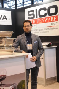
The question about the place of manufacture is typical. It is the same one that every potential customer makes. The interest of consumers towards high quality products drives design to improve its offer in every respect. This trend is very evident on foreign markets. Buyers have understood this and are increasingly demanding.» Nevada Professional is the new vacuum packaging machine created by Bisva and presented at the International Home + Housewares Show in Chicago 2018, together with the entire collection, after obtaining the ETL product certification for USA and Canada.
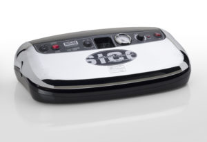
Dr. Biscaglia tells us about the characteristics of this series of products. «The Nevada Professional line represents the SICO KITCHENWARE® production range ideal for families, chefs, hunters, fishermen and for small businesses. The three welds are an absolute news on the market. Equipped with a powerful pump and transformer, they can guarantee speed and professional-level performance. They are designed for a continuous and intensive use.» Nevada Professional, born from the collaboration of the company with external consultants, has an appealing design, and is proposed in the silver, red or chrome finishes.
Another leading brand in the industry is Besser Vacuum. With Francesca Cancellier, marketing director of the company, we can know closely a just prototyped product, but already ready to conquer the market for its particular design.
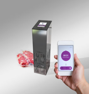
«It is our sous vide tower: a kind of tower that reminds the minimal trend in terms of electrical devices – for example wi-fi speakers, dehumidifiers, lamps – and brings it to the kitchen. The 360º steel gives it a professional touch and strengthens the structure. The color touch screen makes the appliance user friendly.» We are talking about Vacrowner, the new thermocirculator for vacuum cooking. «An appliances – Cancellier explains – that allows the user to heat water in a container, perfectly controlling the temperature and time, equipped with a fan that maintains the water moving and at a constant temperature throughout the area. In addition to all this we have associated an intelligent touch screen connected to an App. This will help those who are beginners with vacuum cooking to be guided in the setting and to realize a rich variety of recipes very easily.»

«At the moment – she added then – we are preparing a total black limited edition that will be available in a few months, dedicated to the design lovers, as well as kitchen ones, but I don’t want reveal too much. I prefer to wait.» As the other companies, also Besser Vacuum created a synergies with designers and industrial designers. «We had a collaboration with a technical consultant that has a long experience in the home appliance field, and we employ young designers inside our marketing team for the development of the project.» Besser Vacuum, as in the case of many other brands of the SDA sector, will not take part to the Salone del Mobile. «Our presence will be rather a virtual presence – explains the marketing director – as during those days we will launch the new e-commerce, where our customers will be able to buy the latest news on-line too. Vacrowner – whose name derives from the mix of Vacuum and Crown, to indicate the king of vacuum cooking – will be one of our flagship products during the launch.»

